Features & Solutions
- Overview
- Content Management
- Content Locking
- Content Rating
- Custom Document Types
- Design
- Document Management
- Files, Images & Videos
- Full Text Search
- Image Gallery
- Linked Documents
- Media Library
- Mobile Sites
- Multilingual Content
- Scalability and Performance
- Security and Membership
- Spell Checker
- Taxonomy
- User Interface Personalization
- Web Parts
- Web Standards
- Widgets
- Workflow
- WYSIWYG Editor
- eCommerce
- Marketing
- Social Network
- Solutions
- All Features
Mobile Sites
Join the Mobile Revolution with NGRPulse CMS
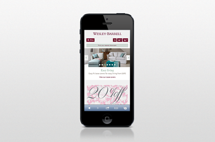
With mobile browsing at an all-time high today, it’s more important than ever for companies to have a mobile-friendly website. Whether customers are browsing from a smartphone or tablet, the design must be responsive to match the device being used, load quickly, and provide a great customer experience. NGRPulse CMS comes with built-in responsive design capabilities, enabling you to create a dynamic website experience for any device.
Responsive Design
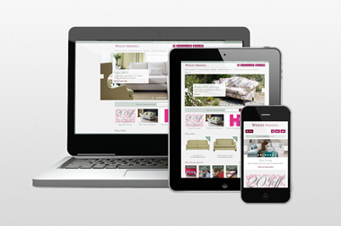
With the responsive design capabilities of NGRPulse CMS, your website design will automatically adapt to different screen sizes, and easily translate to a mobile platform from the desktop version. With responsive design, you create your website once and have it adapt to various screen sizes and devices on the fly.
Preview Website on Various Screen Sizes
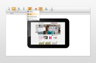
With the mobile preview option, content administrators can see immediately what the website looks like on different screen sizes directly in NGRPulse CMS. It saves their time and allows them to adjust the content immediately if needed.
Advanced Device Detection
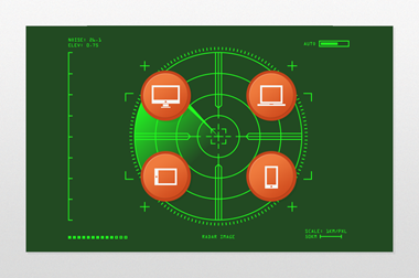
Not only will developers find it simple to create high-performance mobile websites with NGRPulse CMS, but once built, the sites can leverage 51degrees.mobi device data to automatically detect the device being used by the visitor. This will help you optimize the customer’s experience for specific devices and leverage their unique capabilities.
Say Goodbye to Long Load Times with Automatic Image Resizing
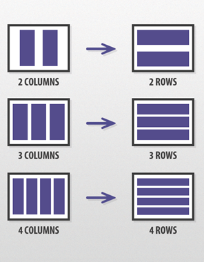
When your site is complete, rest assured that all images on each page will automatically fit to the visitor’s device. This dramatically reduces the site’s load time, and replaces the need for resizing images manually.
Customizable Mobile Layouts
Beyond the standard responsive design technique, developers can also control web page layout on the server side. They can define specific mobile layouts for particular device profiles and ensure that the page contains only content that is actually rendered, which greatly shortens load times. This approach is also suitable for websites that were originally built without mobile devices in mind.
